How To Create A Killer Travel Logo For Your Tourism Business
Your travel logo is one of the most recognizable identifiers of your brand and has an impact on how your business is perceived.
It is essentially, the first impression. That is why it is important to create a memorable one that speaks for your brand and will attract customers.
Think of it this way. Any future potential clients will likely interact with your logo before any other part of your business. It may be when they come across your social media profile, receive an email newsletter, are directed to your website, or are exposed to any of your other marketing materials.
Simply put, this interaction may well be the start of your relationship.
The Ultimate Guide To Scaling Your Tour Operator Business
A 150-page guide that covers everything from establishing a winning travel brand to delivering a market-leading service
Download FREE eBook
Getting Started
As is always the case, you need to have a plan before you begin. When it comes to creating your killer travel logo, you should start by deciding how it is going to make your business stand out from the rest.
It is important to get this part right early on because as a whole, the logo will communicate your brand's personality to your customers. It is going to peer back at them from your website, emails, business cards etc. so they will be forming an opinion of your business right away.
It is advisable to undertake a bit of market research here too. This should help you to identify two things which will be of use when it comes to the design process:
- Firstly, take a look at your competitor’s logos to see how they have chosen to identify their brand for comparative measures
- Secondly, test versions of your logo by asking your clients/business associates/employees/trusted peers what they think

Remember that ultimately, you do not need to settle on one single version of your logo. Instead, you can choose which version of it to use in specific instances.
For example, on a weekly email marketing newsletter you may opt to use a simple icon and catchphrase version. But on your website home page, the entire slogan and image elements would be a more suitable choice.
So long as the versions are recognizable, share design and color characteristics, and are synonymous with your brand, you can choose what is appropriate.
Now To Create Your Killer Travel Logo
What every brand hopes for when it comes to designing a logo, is to create a representative visual that turns into a household name. With this in mind, a well-designed logo should be recognizable on its own outside of the context of your website or social media profiles.
Style and Type
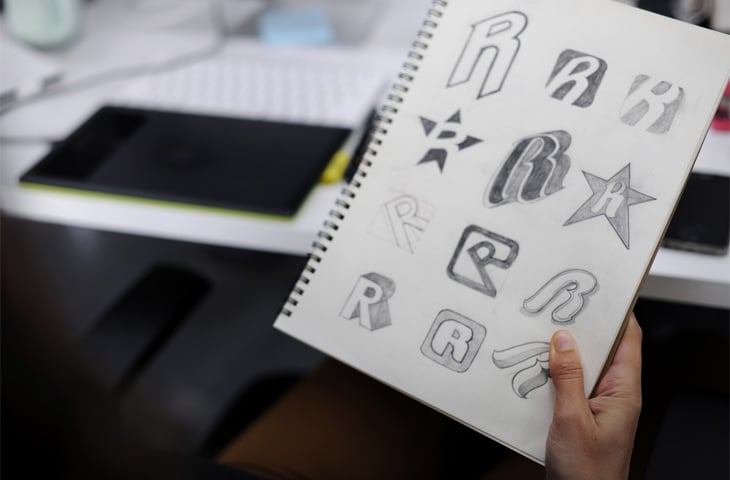
Whether you are making a start on designing your own logo or sitting with a designer to hash out the concept together, you will need to settle on a style and type for the representation.
Style-wise, options to consider could include something along the lines of a modern or vintage/retro design, a handmade look, perhaps you are going for a fun feel, or settle on a classic depiction instead.
When it comes to the type, you will need to decide whether you are looking at using a font based logo, image to illustrate your business service, abstract graphics, an emblem, or even a combination etc.

Color Is Important
So much so that studies have been carried out on the subject. It turns out that the psychology behind color is pretty complex as different hues are associated with different emotions.
The takeaway from the study is to say that the color you choose to represent your brand identity, will have an effect on how people feel about your tourism business. With this in mind, make sure that the association you create is intentional and one that you have in mind.
Use Typography Correctly
The font you use and how it displays is another visual element to consider for your travel logo. It too affects how people identify with your brand and choosing the right one will help you give your business a unique look.
A customized typeface goes a long way in making your logo unique, but take a minute to consider its overall longevity and how you think it will be received in a few years time. Ideally, you want to avoid any major overhauls of your logo for at least ten years so as to maintain consistency within your brand's identity.

Some Best Design Practices
Create Both A Light And Dark Version Of Your Logo
Seeing as your travel logo is going to appear in a variety of contexts across your marketing materials and on the internet, a good practice is to create both light and dark versions of it.
This is because not all backgrounds are the same color. So, while it may look appealing on your website that sports a white drop, it may blend in or look out of place on another.
Put Together A Brand Guide
Now that you have a great visual identity for your tourism business, you need to make sure that it remains representative of your brand. This is especially true considering that it is going to be used in a variety of contexts on a number of platforms.
A brand guide is a set of documentation for your team to refer to every time they use your logo in marketing materials.
Information included in the guide could include color hex values, color palettes, font styles, when to use them (for example in headers or body), approved variations of your logo etc.
The uniformity rules in this documentation play an important part in making your tourism brand identifiable. Imagine that your logo was tweaked slightly to suit someone every time they used it – eventually, you would end up with something that looks nothing like your original approved design.
You will also need this guide for future reference. At some point, you might decide to update your logo, and there is no guarantee that you will use the same designer to do the work.

Summary
We have touched on the basics in this article, but the reality is that there are other things to consider when designing your travel logo. In addition to what we mentioned above, among others, there are active vs passive logos, negative space, as well as proportion and symmetry elements to think about.
The good news is that a professional designer will be able to help you with all of that. Ultimately it is a process worth taking seriously as the end product is a direct reflection of your travel brand and affects how people interact with your business.
New resources, straight to your inbox
We’re committed to your privacy. WeTravel uses the information you provide to us to contact you about our relevant content, products, and services. You may unsubscribe at any time.


